Fans divided over football club's new crest

 Maldon & Tiptree FC
Fans of a non-league football club are divided on a new design for the club's badge.
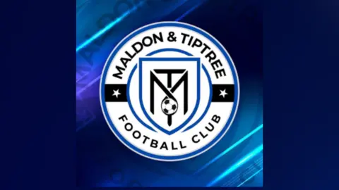
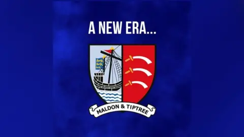
Maldon & Tiptree FC revealed its new emblem on Facebook, showing the combined letters M and T, replacing the former design of a traditional sailing ship and the three curved blades motif of Essex.
On Facebook, the Isthmian League North Division side said "over 100 fans voted unanimously for this new club badge to take us into a modern era".
Some fans welcomed the new design, but there was also criticism, with one person saying the old logo had "heritage and charm" but the new one was "soulless", and another posting: "RIP to the club's identity."
 Maldon & Tiptree FC
It follows a takeover of the club earlier this month by Barrie and Scott Drewitt, who run Chelmsford-based property firm the Drewitt-Barlow Organisation.
The new badge was adopted at a fans' meeting at the club's ground on Thursday night.
The club, nicknamed The Jammers, currently plays in the eighth tier of English football but said it was looking "to move up the football pyramid".
 Barrie Drewitt-Barlow
On Facebook, one fan posted: "Watch the Jammers roll on to the National League. Going to be awesome."
Torquespeed FC, a neighbouring youth football club in Essex, wished the club "good luck" in its "new era".
"Great to see one of our local neighbours getting good investment to push on," it said.
Follow Essex news on BBC Sounds, Facebook, Instagram and X.