Norwich City Football Club changes logo for 120th anniversary
 Norwich City Football Club
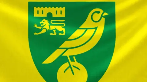
Norwich City has changed its logo to mark its 120th anniversary.
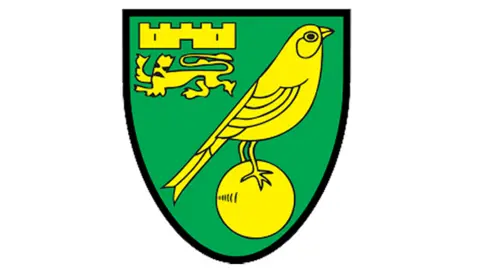
The updated branding includes a new badge that has been modernised for the "digital age" and a new typeface called "Norwich Weave", the club said.
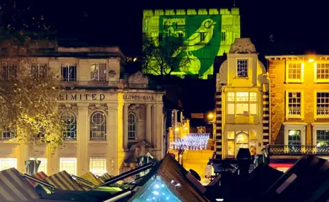
The crest was unveiled in November when the new images were projected onto Norwich Castle.
The club said it consulted with supporters and it was "proud of our history and the connection the club has with the heart of the city".
 Norwich City Football Club
It was two years in the planning, working design agency SomeOne, it added.
The badge "retains its traditional elements, including the canary, castle and lion", it said.
 Norwich City Football Club
The Canaries were relegated from the Premier League to the Championship in April.
The branding "pays homage to Norwich's industrial past, when during the 16th Century the textile and weaving industry in the town boomed following an influx of refugees from the Spanish Netherlands, known as 'The Strangers'," the club said.
Its new bespoke typeface takes inspiration from weaving practices.
Allow X content?
Zoe Ward, its executive director, said: "It was important that we kept the traditional elements of the badge, but modernised and evolved it so it was fit for purpose in a digital age and allowed us to get consistency across our stadium and publications.
"I would like to thank all those who have worked hard on this project and all the fans and stakeholders who helped us with the consultation process.
"We are very pleased with the outcome and believe this is an important step for Norwich City going forward."
 Rob Butler/BBC
Find BBC News: East of England on Facebook, Instagram and Twitter. If you have a story suggestion email [email protected]
